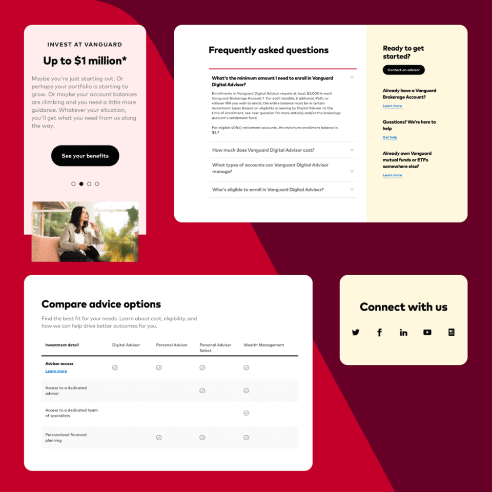
Case Study
Vanguard
Building a new look for the next generation of investors

Overview
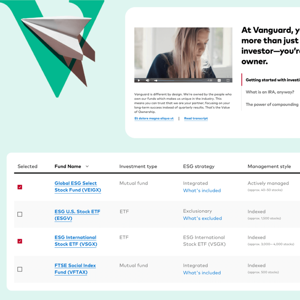
Vanguard is the largest provider of mutual funds and the second-largest provider of ETFs, with about $7 trillion in global assets under management. The brand, specifically its retail business, underwent a total reimagining of its visual identity and collaborated with Spark on building the foundational design system that would translate this new look and feel to the web, inviting a new generation of investors to become part of Vanguard’s unique investor-owned model.
Services
- UI kit theming
- UX/UI design
- Prototyping
Technologies
- Sketch
- Miro
- Abstract
Timeframe
- 1 month
Visit
Challenge
A digital foundation in 4 weeks
With an approved newly developed brand identity, Vanguard was excited to quickly push meaningful aspects to the web first for the retail investor business. But it wasn’t as simple as swapping button styles. Given the scale at which it would need to be managed and deployed over time, the team knew they’d ultimately need this work to establish the foundation for a whole-new design system for the enterprise, ideally in a month.
Process
Sprinting into action
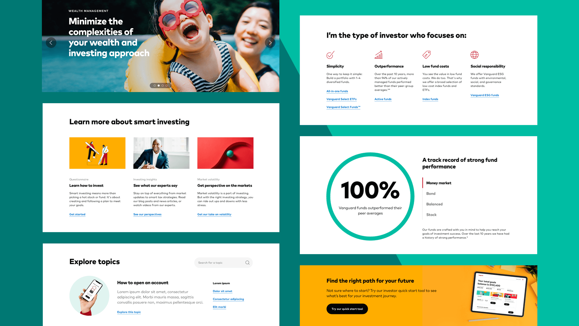
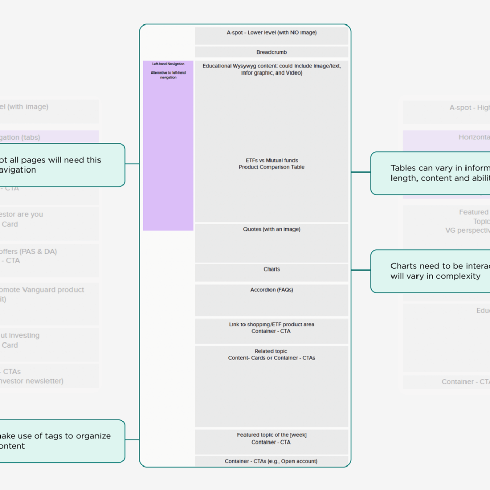
In collaboration with Vanguard’s retail design team, Spark led a series of targeted sprints focused on generating the necessary components, patterns, and layout permutations to satisfy the content requirements of all top-level and secondary page templates within the retail investor site. Daily stand-ups, collaborative tools, and in-meeting feedback with an experienced team made it possible to work quickly and confidently.
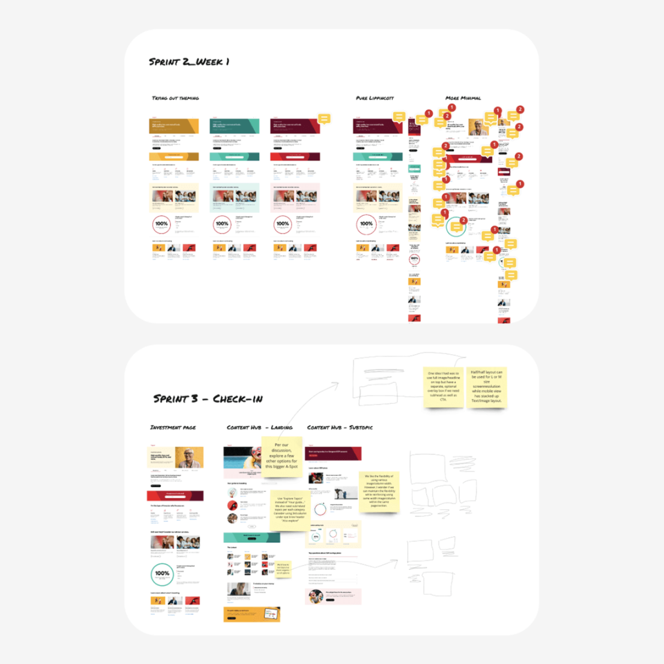
Solution
A modular dev-ready MVP component library
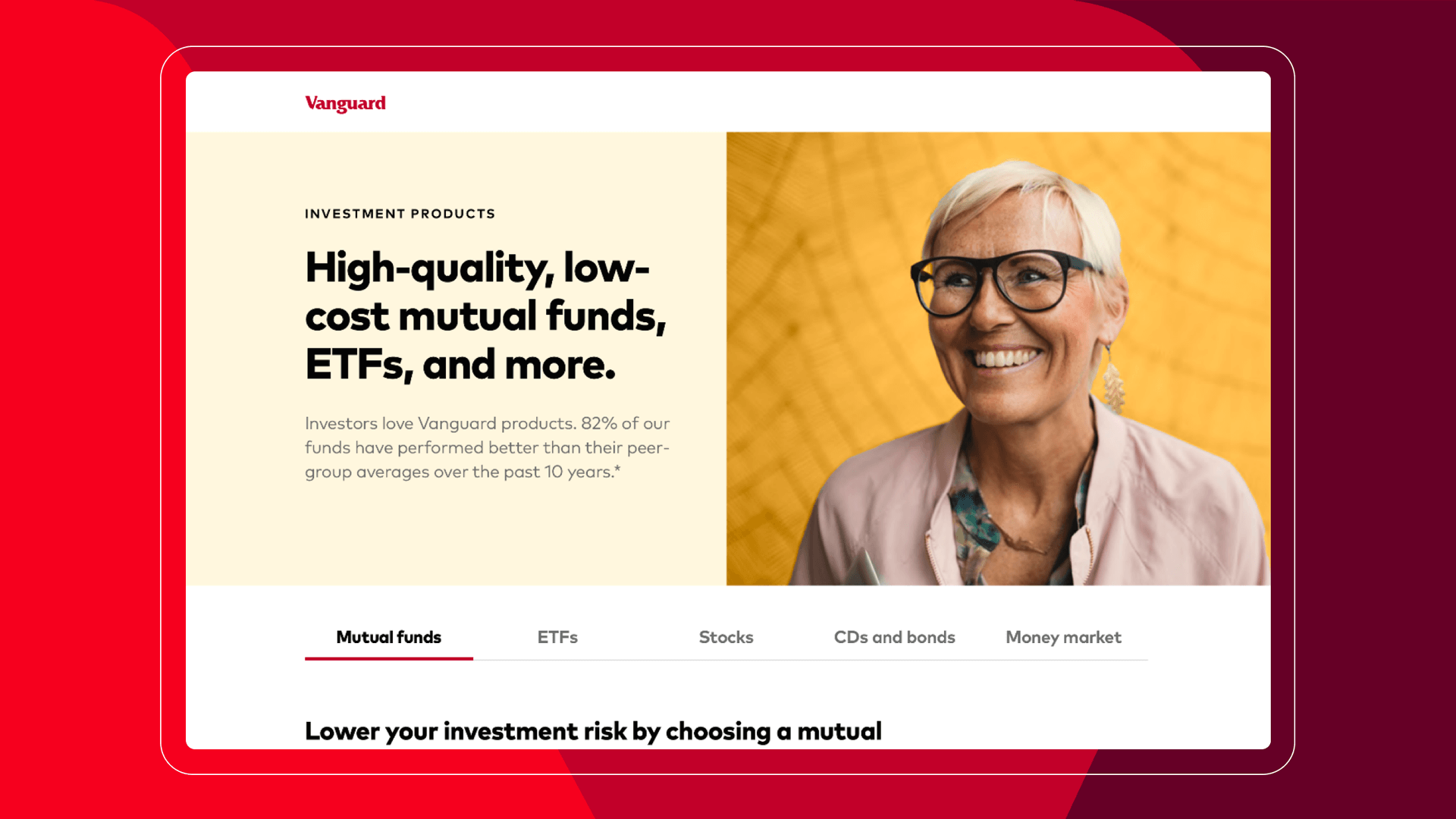
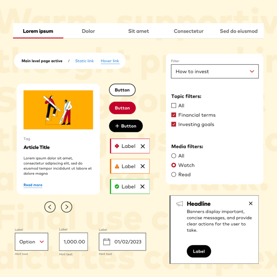
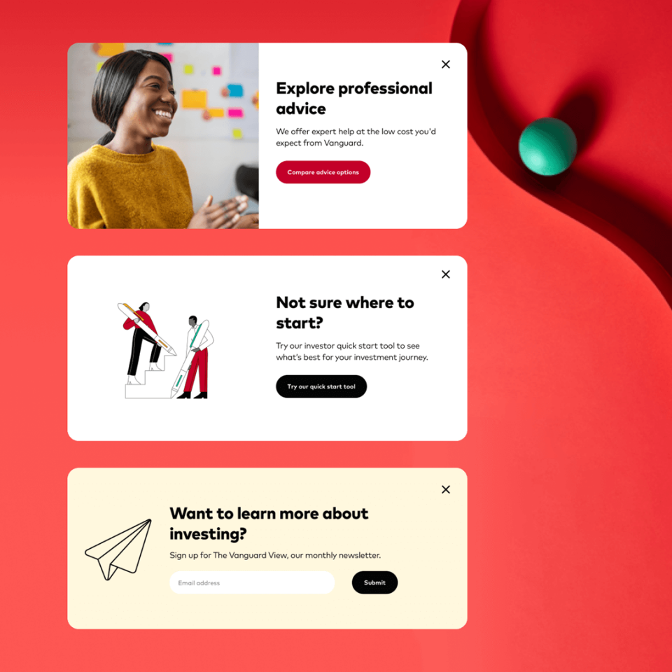
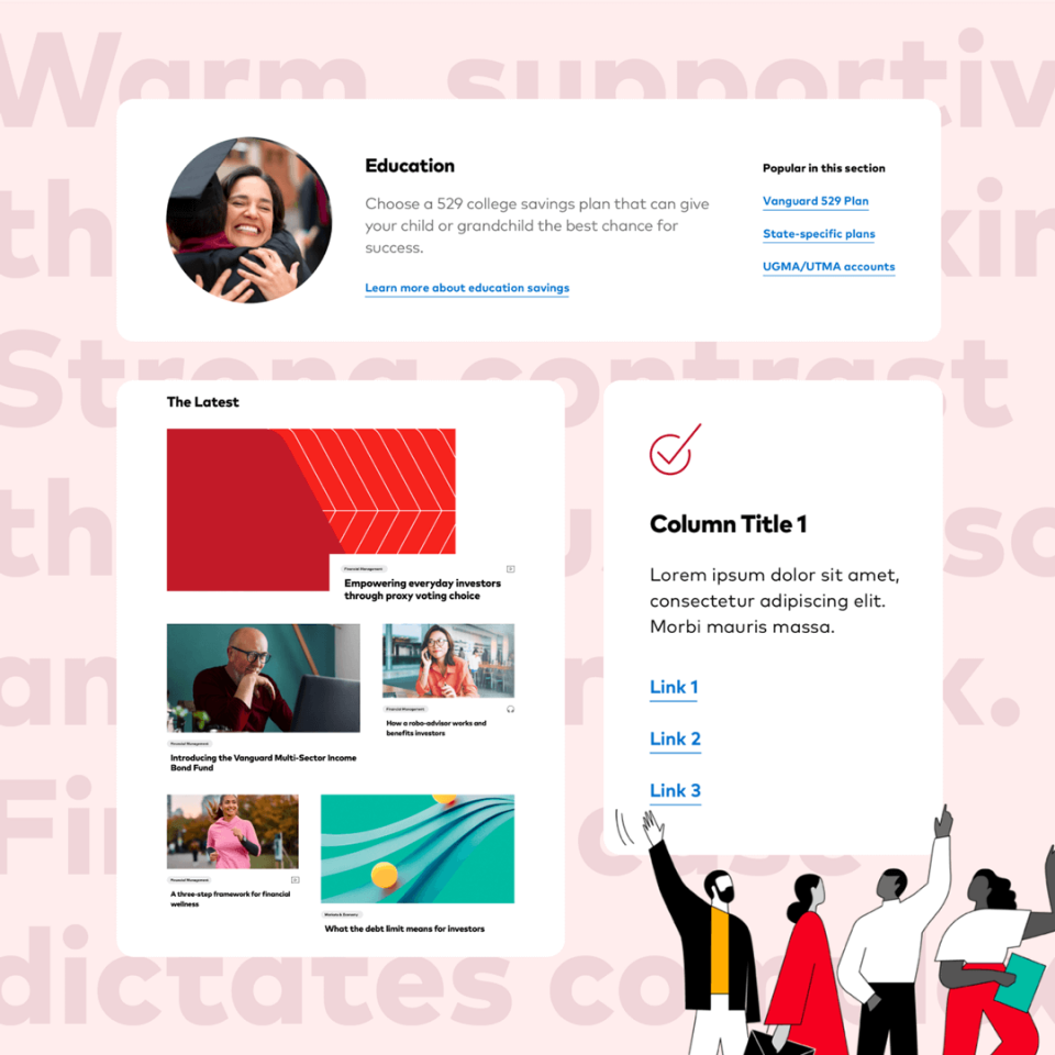
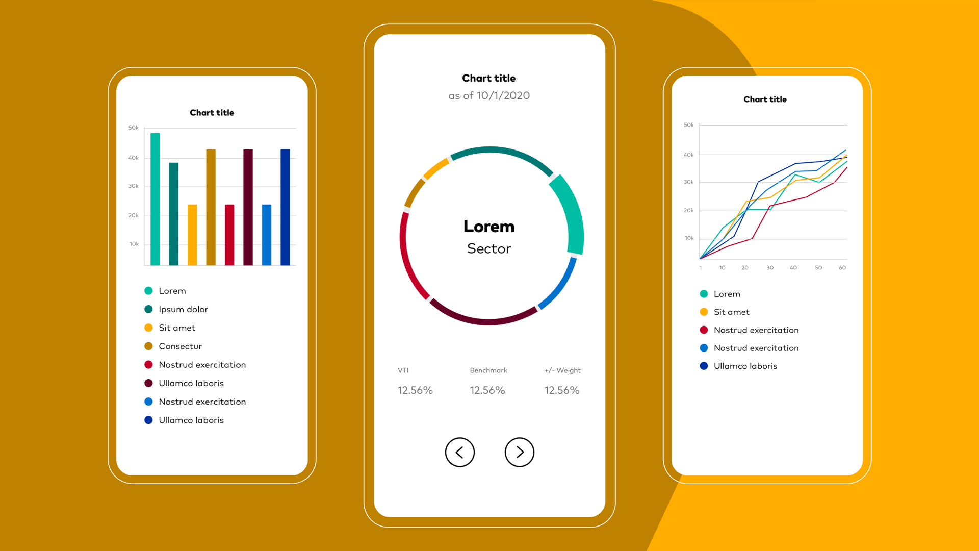
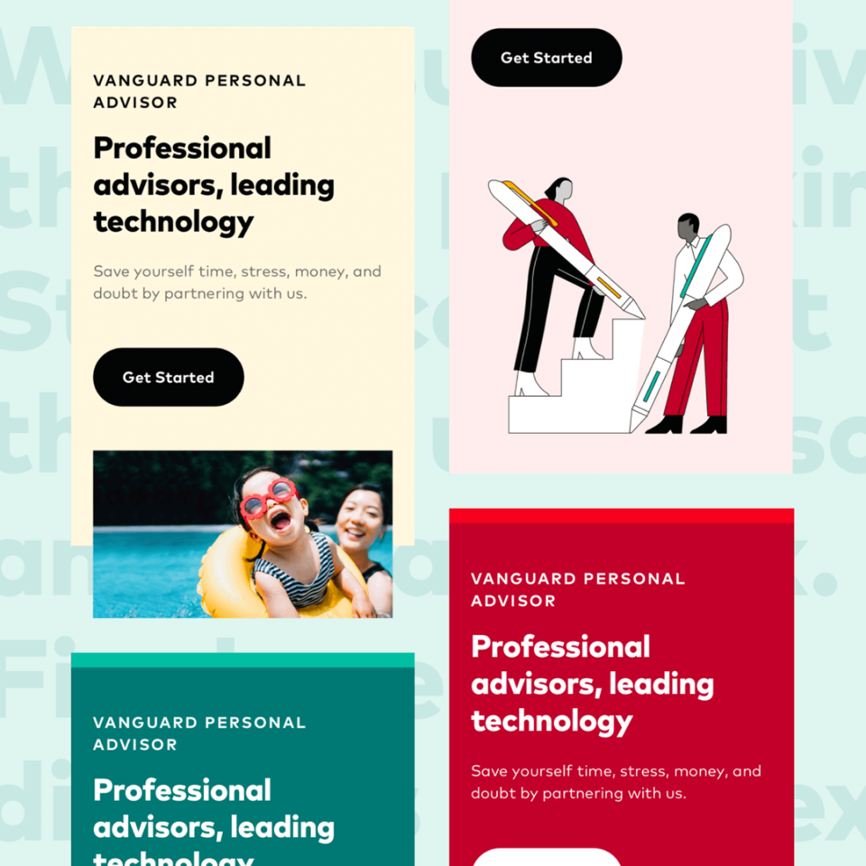
In a matter of 4 weeks, Spark delivered a comprehensive set of high-fidelity components and page layouts that reflected not only the business’s new visual design but also improved upon existing content interactions and defined critical areas not addressed within the new branding guidelines like charting and data viz.
