Case Study
AdMed
Regenerating a leader in scientific training

Overview
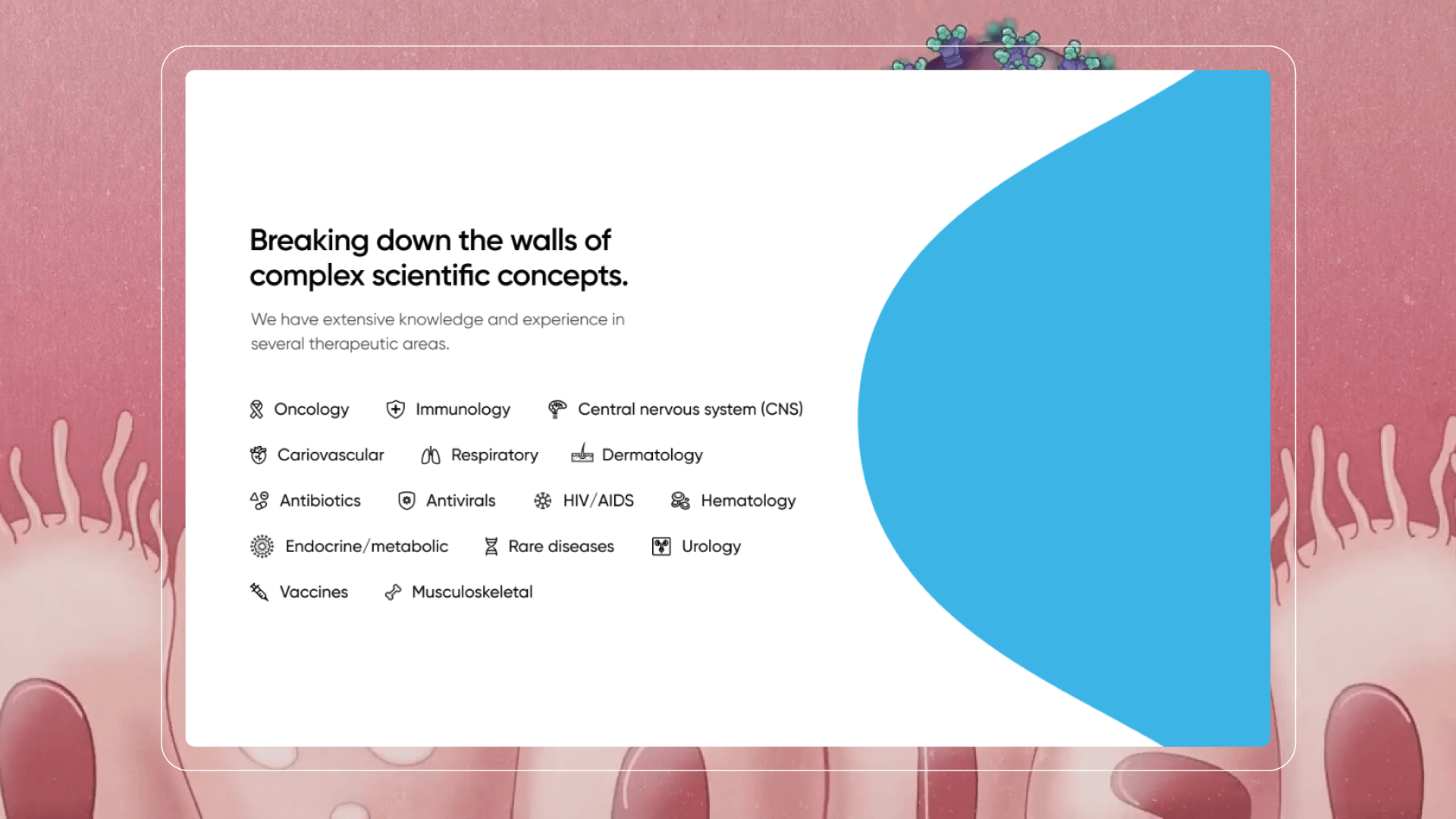
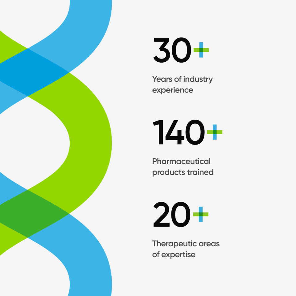
For over 30 years, AdMed has created modern training tools for biotech, diagnostic, pharmaceutical, and medical products dedicated to breaking down the walls of complex science across a variety of innovative formats, using the latest technologies, from Augmented Reality to Artificial Intelligence.
Services
- Stakeholder interviews
- Concept design
- UX/UI design
- Interaction design
- Front-end development
- Holistic QA
Technologies
- WordPress
Timeframe
- 4 months
Visit
Challenge
Growing pains
The AdMed team struggled to maintain their website and felt their current experience did not represent them as the industry leaders they are. They were looking for a new experience that more effectively showcased the breadth of their capabilities and expertise while strategically refocusing on lead generation to support the company’s business growth.
Process
Putting the brand under the microscope
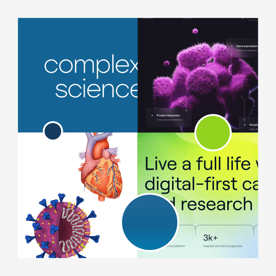
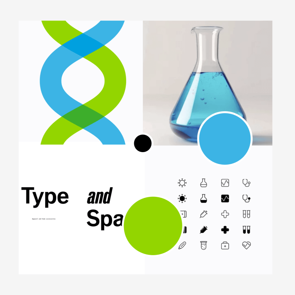
Spark met with internal stakeholders to understand what sets AdMed apart from its competitors and determine the best ways to highlight its unique service offerings and capabilities. Following that, we conducted a visioning workshop to ensure alignment with the team’s goals and desired brand perception. This collaborative workshop would also help define how AdMed’s visual identity could manifest within the new site. From there, Spark developed two conceptual directions to serve as the foundation for the website’s overall design.
Solution
An infectious design
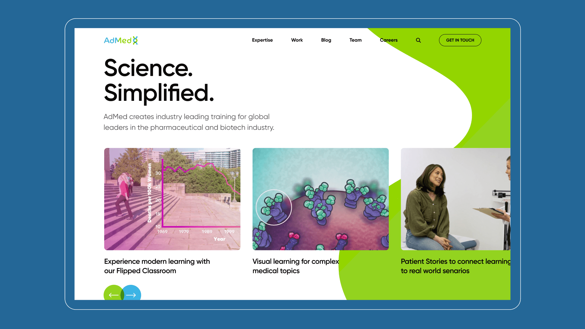
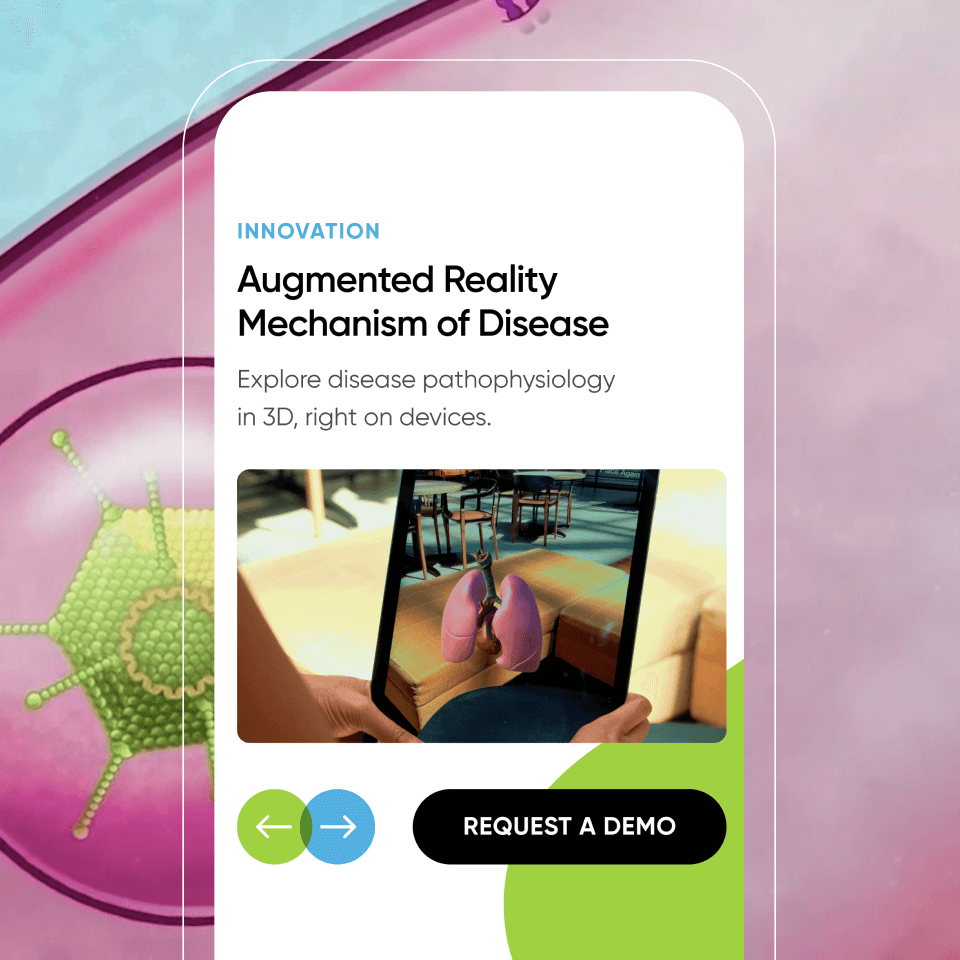
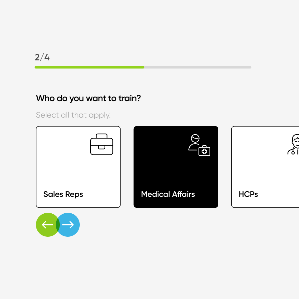
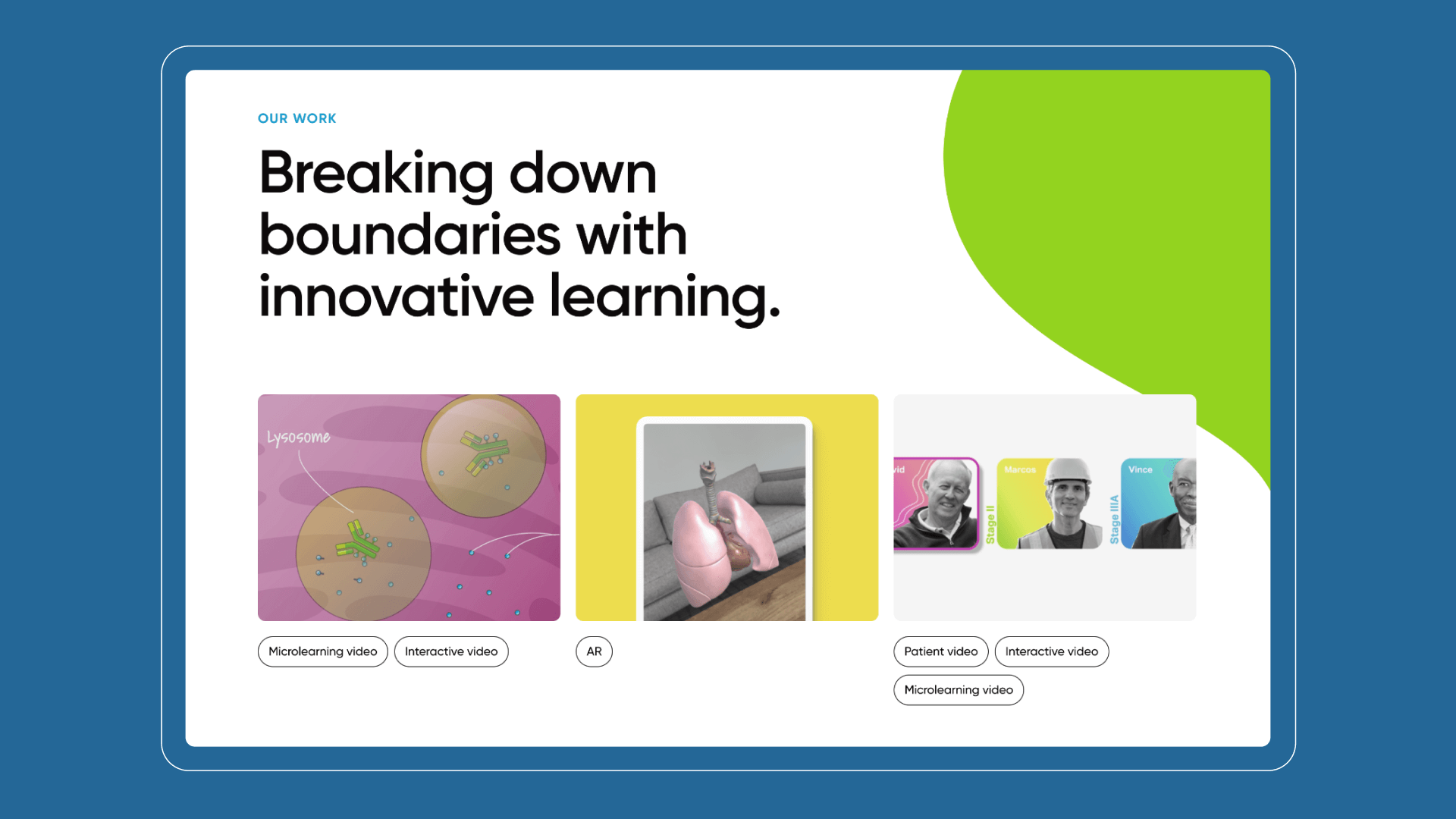
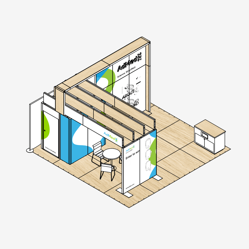
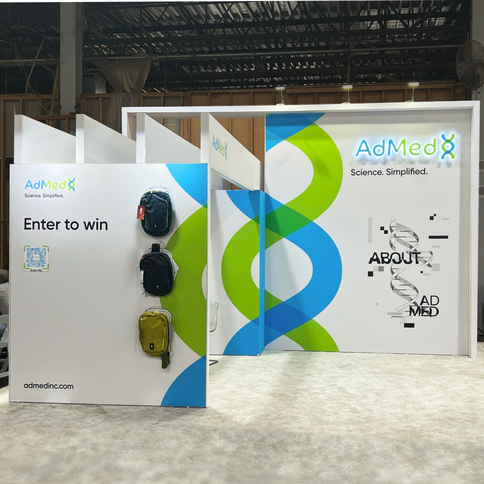
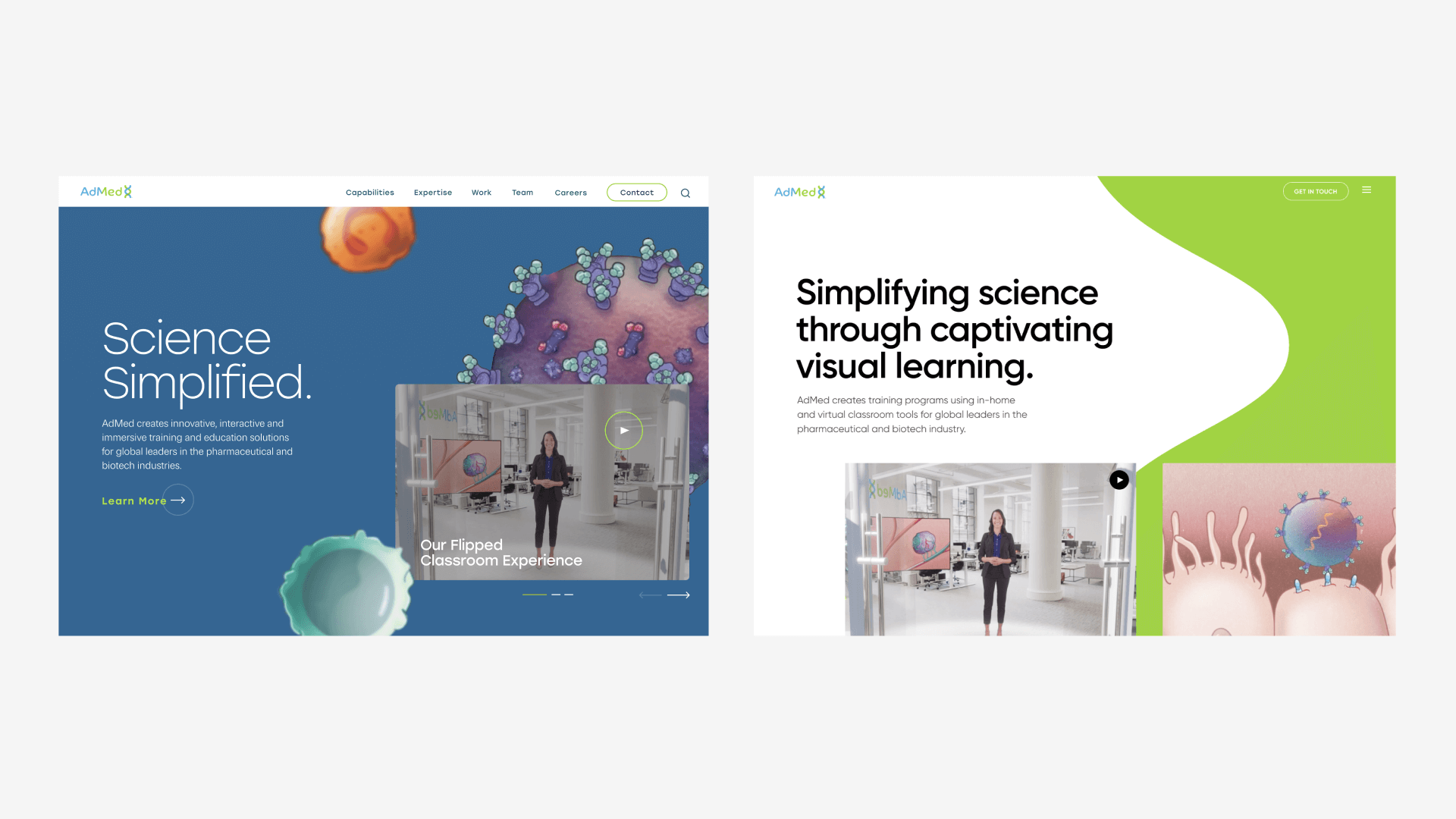
Leveraging unexplored aspects of the existing brand, we created a clean, sophisticated, and scientifically inspired aesthetic that elevates AdMed to the long-time leader it has been and the growing enterprise it is becoming. The site has defined a totally new visual language for AdMed, with Spark extending the design with a refreshed set of marketing materials, including presentation decks and tradeshow booths, ensuring a cohesive and effective reintroduction of AdMed across its most important touchpoints.
