Is your website or app doing all it can?
A
well-branded digital experience can be your competitive edge, setting your product apart from rivals in the market. No matter what space you’re in, whether retail, healthcare, or finance, chances are you have competitors offering similar services of similar quality. In this case, what makes you stand out can come down to how your product looks and feels and how the experience reflects your brand’s values.
But making your brand shine through a digital product isn’t as simple as slapping a logo at the top of a screen. If your brand has a style guide, it can play a role in this exercise, but it usually lacks guidance for all the subtle and delightful ways a brand can be applied to a digital product or website. From MVP apps to long-standing businesses, here are a few ways we’ve helped establish and amplify our client’s brands through our work.
Build it, and brand will come
KHALO approached Spark, needing a look and feel applied to the wireframes they created for their food and calorie tracking app. They had yet to establish a formal identity, so our work would set the tone for where that might go. The client wanted their product to look friendly, organized, exciting, and upbeat, avoiding some of the sterile looks a lot of food tracking apps can have, going for a more colorful and approachable style like Headspace. Through these first few explorations of the dashboard, you can already see the difference changing the color, type, and iconography can make to the app’s mood.
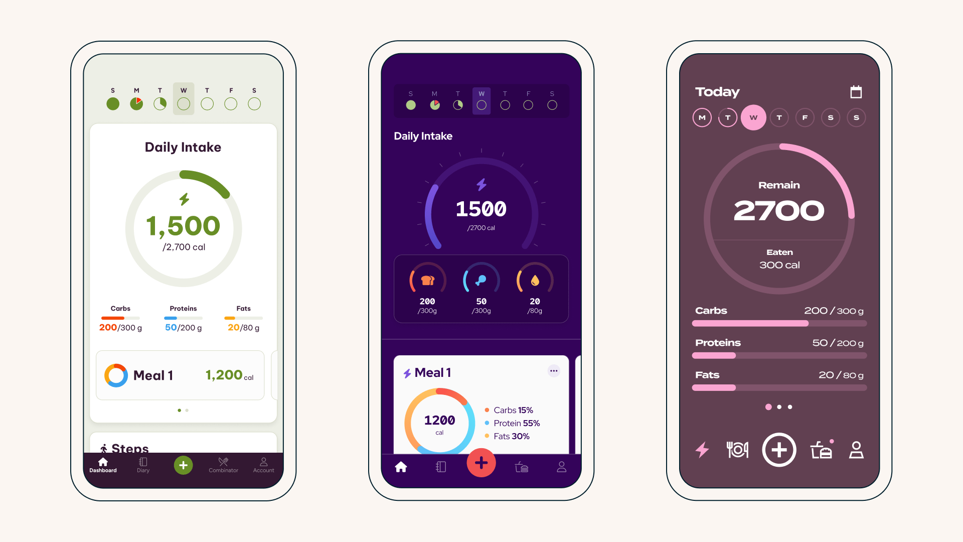
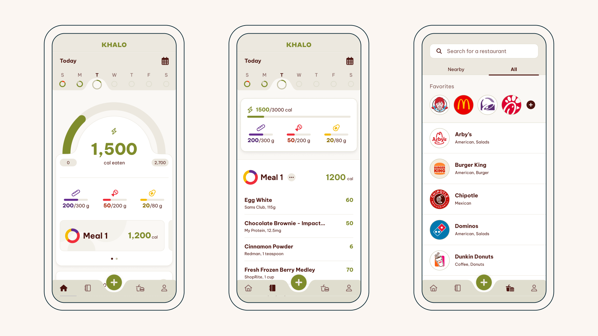
In the final version of the UI, we established a look and feel for KHALO that leverages circles and curves as a motif to project a soft simplicity. We also used a color palette with a warm, neutral base, reserving pops of color for essential data like the calories and macros. This design projected the sense of trust and friendly, unintimidating vibes the client sought, giving them a design to rally their company vision around.
(Re)Make the most of what you got
For over 30 years, AdMed has designed and delivered modern training tools for pharmaceutical, biotech, diagnostic, and medical products dedicated to breaking down the walls of complex science. When they asked Spark to redesign its website, AdMed already had an established visual identity but was willing to see it portrayed in new ways.
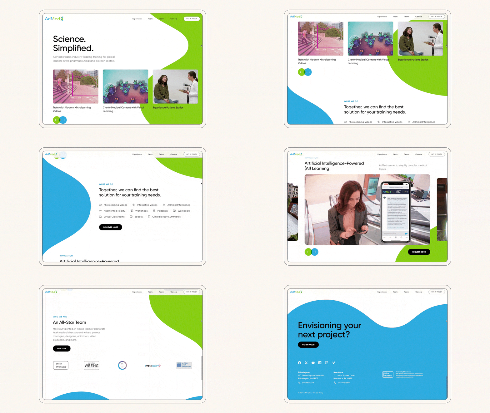
We developed an all-new take on AdMed’s identity using what was hiding in plain sight. Organic, animated shapes pulled out of the existing logo gave us a simple scientific-feeling element that we could use to help frame and lead users through the content. New, more modern choices for typography and iconography offset this playfulness, balancing the crisp and corporate feel AdMed wanted without feeling clinical.
How it sounds is as important as how it looks
MarketGrader offers individual investors and advisors a powerful platform to achieve higher returns. When they approached Spark, they knew they had not just a visual problem but a verbal one, too. While there were product features and an all-new freemium model to figure out, investors didn’t clearly understand all the platform currently had to offer or the impressive methodology behind it all. So, while we lifted their website’s look and feel to better reflect the business, we also gave the most critical content a verbal makeover.
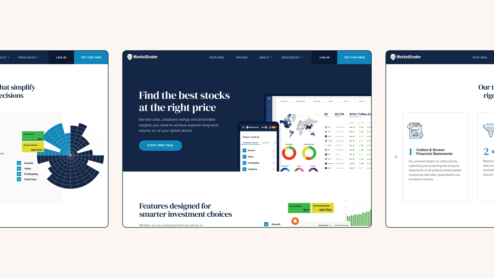
Through our research and findings, the taxonomy and copywriting changes we made would more effectively cast MarketGrader as the innovative experts they are and investors need. While fintech in this space is complex, our more straightforward approach kept things professional yet approachable while emphasizing everything that makes MarketGrader, its approach, and its product unique.
All-in from the start
Juvenescence is a biotech and life sciences company leading the movement to reimagine human longevity and vitality. We knew the JuvYou app we were creating with them would be entering an extremely crowded and mature space in health and wellness. This reality put an even greater emphasis on branding to help it stand out from the crowd and give users the confidence to download.
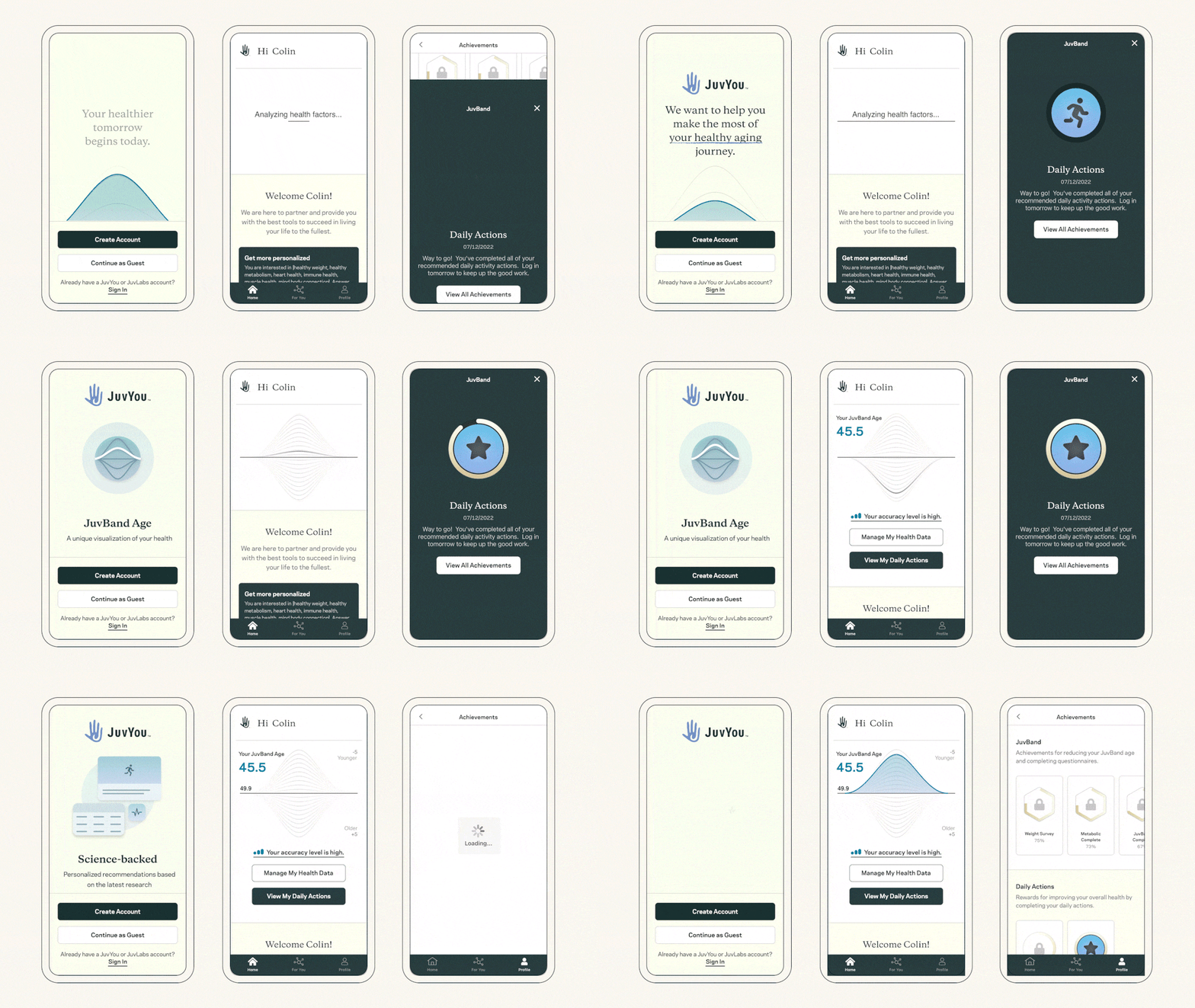
The client understood every element had to be carefully considered, from their proprietary biological aging graph to the typography, colors, illustrations, photography, copywriting, and animations. While going this comprehensive isn’t typical of an MVP, the team felt it was a necessary investment to present the most realized vision of the brand and what Juvenessence believed it could offer customers from the start.
From the thinnest creative brief to big-budget productions, these are just a few ways we’ve helped brands express themselves within their digital experiences. Next time you use your favorite app or website, try thinking about whether this one button, illustration, or interaction is helping reinforce the brand. Or maybe how can your digital brand shine through even better? And if you need help, let us know. We know how to help you stand out.

